Buddi App: Case Study
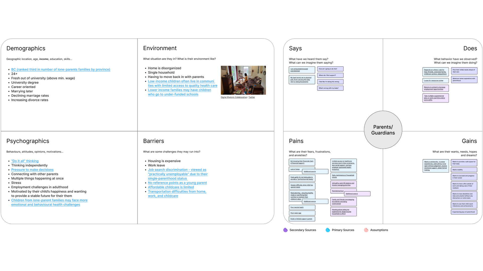
  • UI / UX

  • Art direction

  • OOUX

  • User Research

  • Wireframing

Banner for Buddi App, featuring Buddi mascot
  • Timeline

  • 4 weeks

  • Tools

  • Figma

  • Adobe Photoshop

Problem

Busy parents have difficulty balancing responsibilities throughout the week. Commuting between work, home, and daycare takes a considerable amount of time, making it difficult to seek adequate care for their child within the busy healthcare system.

Solution

In order to help busy parents, I proposed an app that helps parents take their child’s health into their own hands by providing accessible and digestible lessons and tutorials on common health conditions.


Back to Project

Research

In order to better understand the target audience, I conducted research using empathy mapping backed by secondary sources.
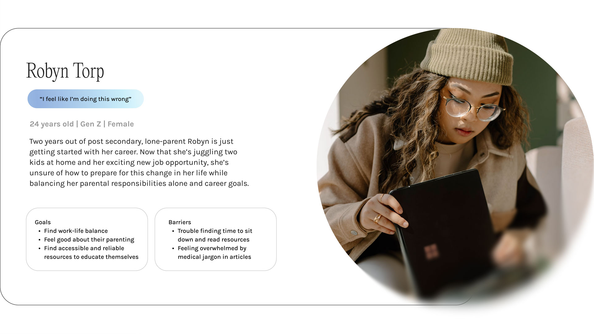
Buddi app branding mockup
            with primary colors and interface elements

User Persona

Using the information I collected through the research process, I then synthesized all the information to create a user persona of the primary audience for the product.
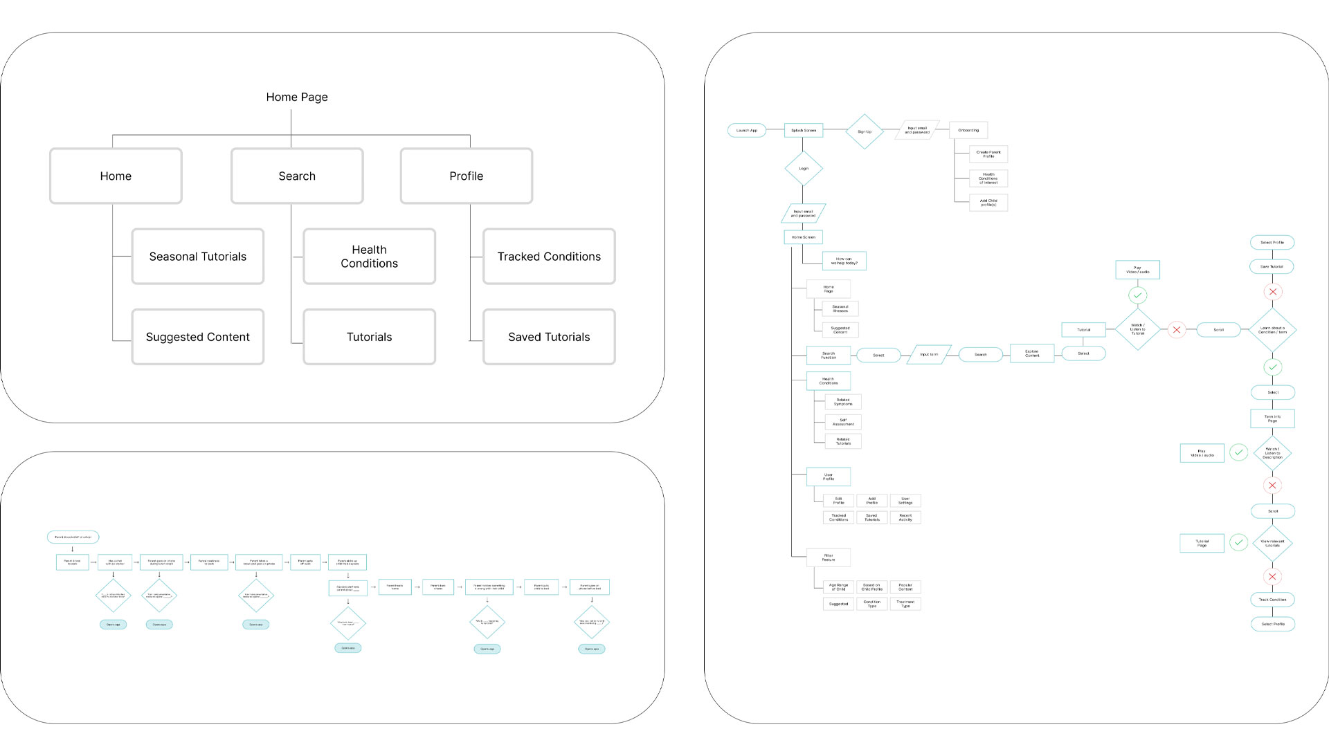
Buddi app branding mockup
            with primary colors and interface elements

OOUX

To build a more intuitive and consistent experience, I applied an object-oriented UX methodology throughout the project. I started by identifying the core objects users rely on, then mapped how they interact, change, and connect. This approach gave the design a strong foundation and made it easier to craft interactions that match how people naturally think about the product.

  • OOUX user flows
  • OOUX object
  • OOUX relationships
  • Gibbet
  • Buddi user flow diagrams outlining how parents navigate health lessons
  • OUX object map showing core objects and system structure for the Buddi app
  • Visual map of OOUX relationships between Buddi app objects
  • Visual map of OOUX relationships between Buddi app objects

Initial Sketches

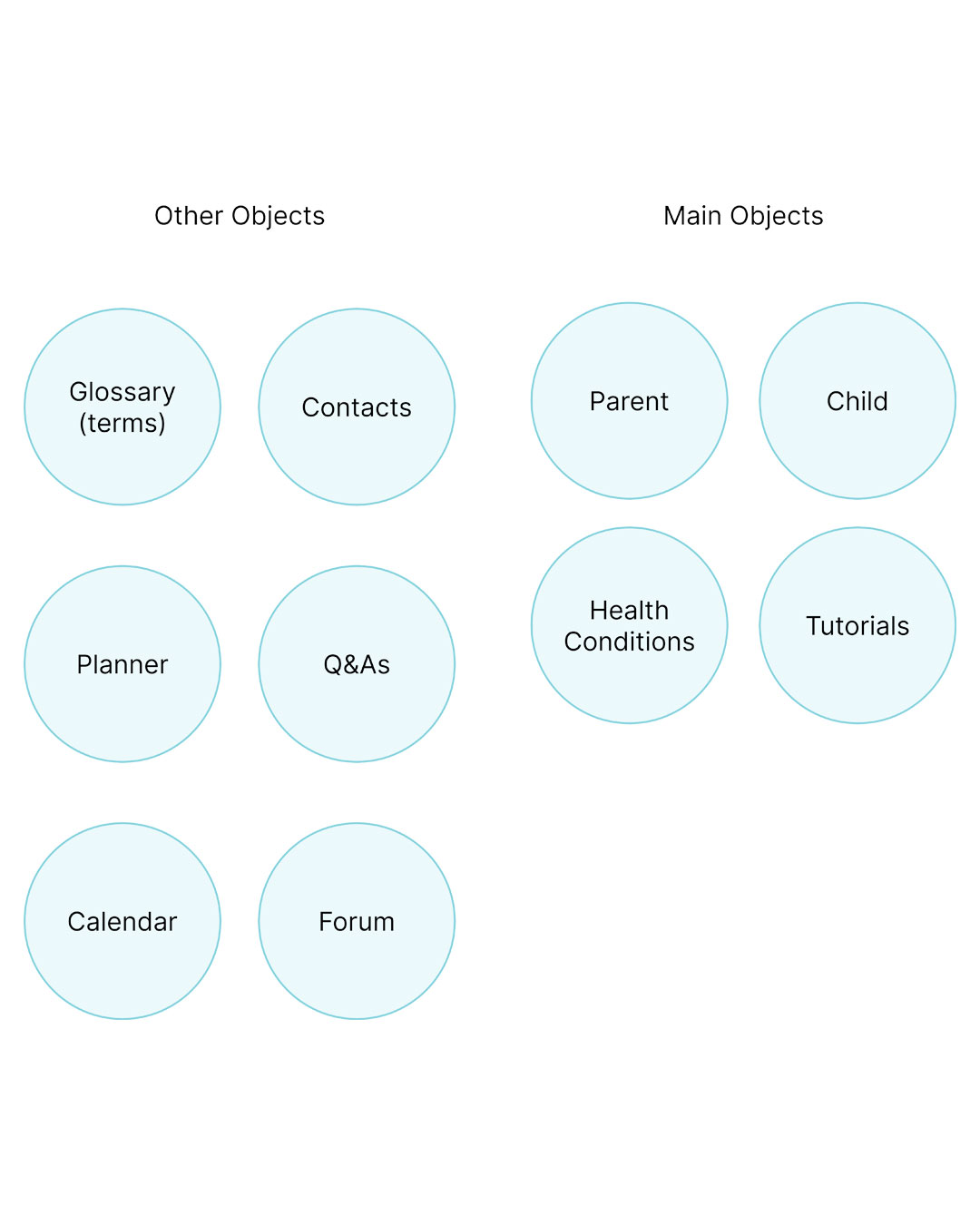
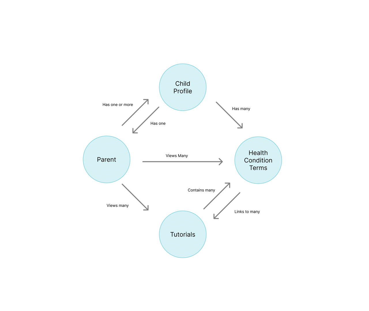
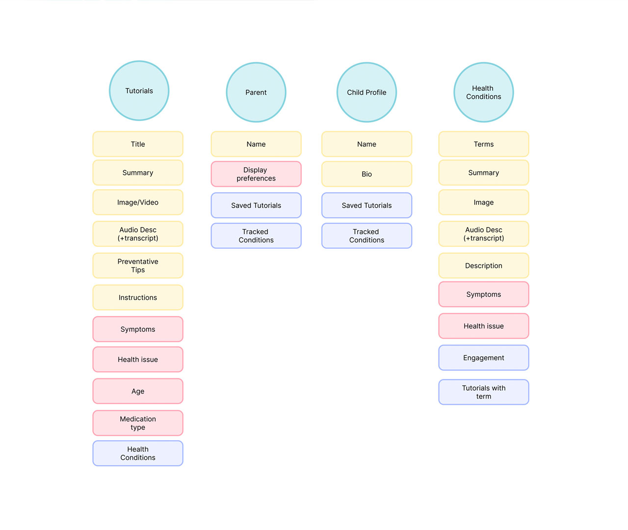
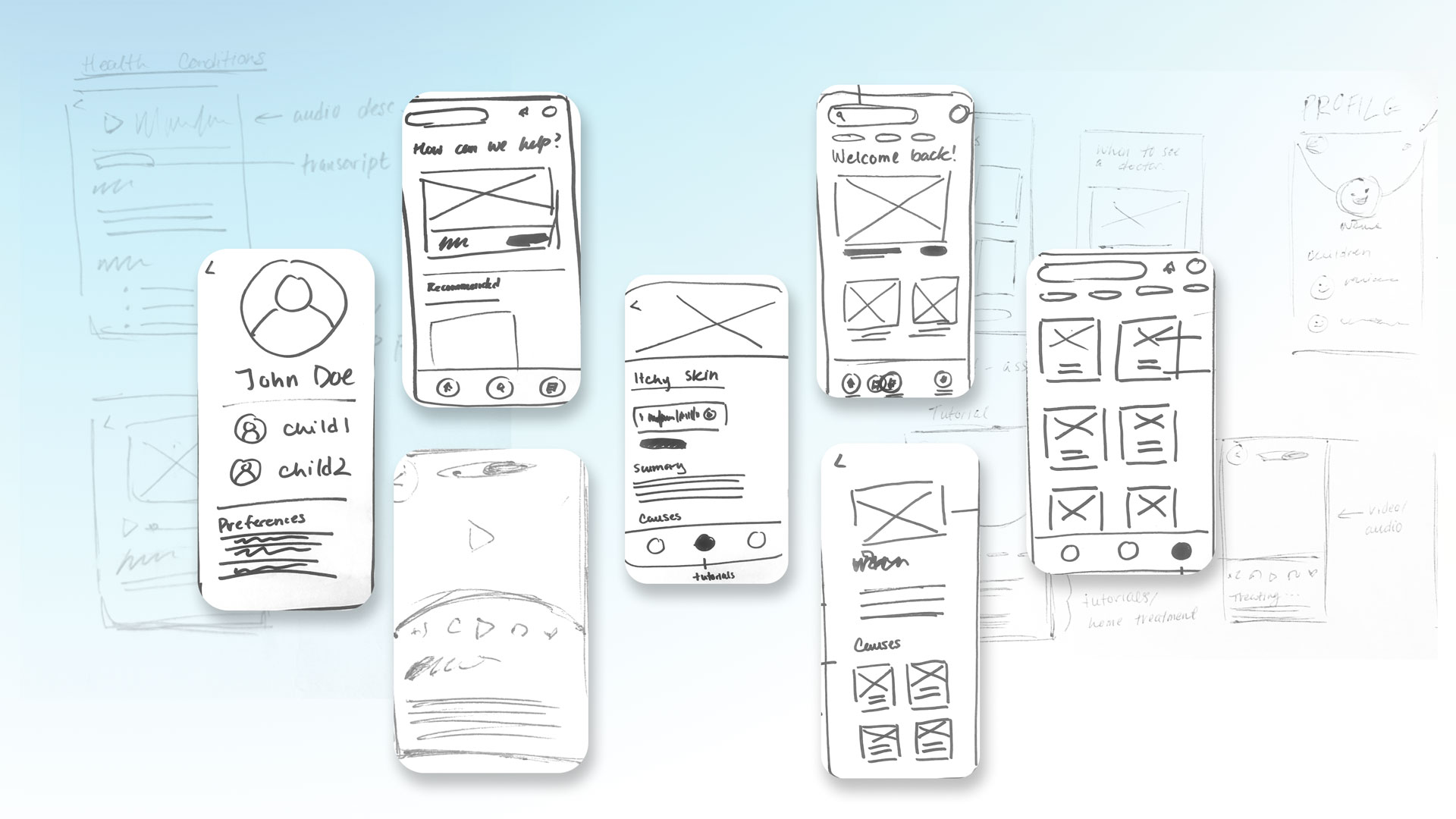
In order to begin the design process I began to draft low-fidelity wireframes to explore possible layouts and how features would appear on the app. During this step, I looked back to my OOUX mapping in order to stay grounded and meet user needs and goals.

Buddi app branding mockup
            with primary colors and interface elements

Wireframing

After exploring rough sketches of possible designs and screens for my app, I used figma to create wireframes in order to better visualize hierarchy, bring clarity to interactions and features within the app, and better focus on layout.
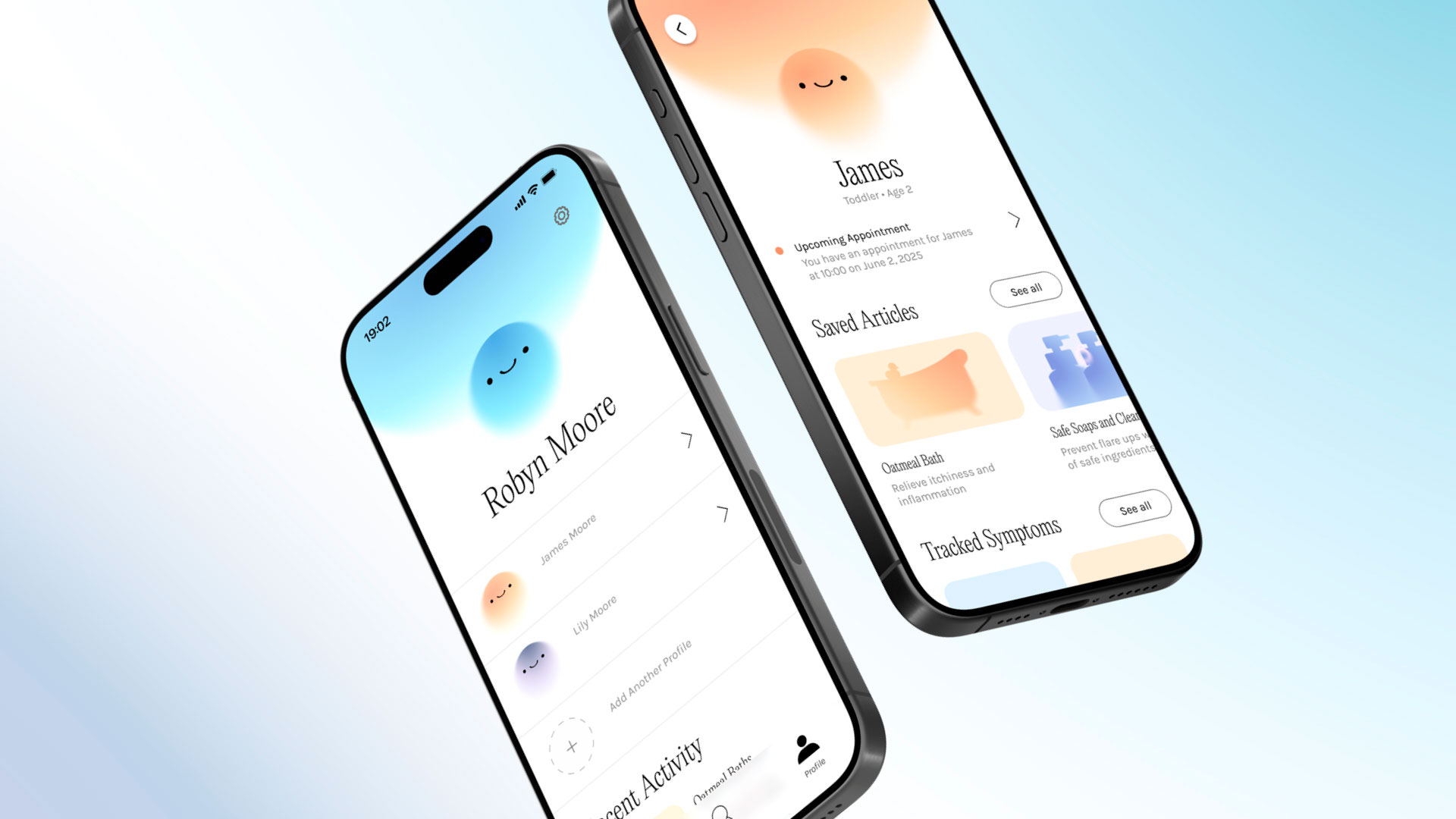
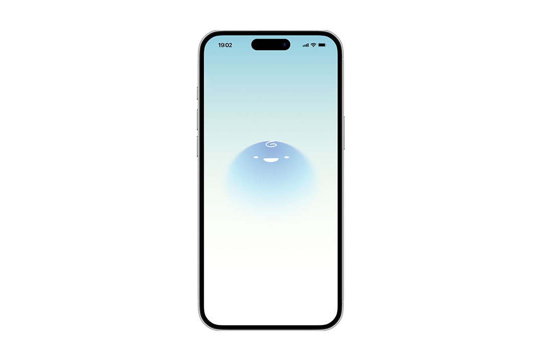
Buddi app branding mockup
            with primary colors and interface elements

Moodboard and Art Direction

After designing the functionality and features of the app, I began to explore the visual identity for Buddi. the idea was to create a visual aesthetic that was light and airy in order to be welcoming to parents, but not overly childish.

Art direction moodboard featuring soft colors, playful icons, and calm healthcare visuals

Hi-fidelity

The final design focused on applying the branding consistently across the apps visual system to create a cohesive and smooth experience.

Buddi app branding mockup
            with primary colors and interface elements
Buddi app icon featuring a simple rounded character face in soft colors
Buddi mobile mockup showing the child profile interface

Prototype

Buddi app icon featuring a simple rounded character face in soft colors

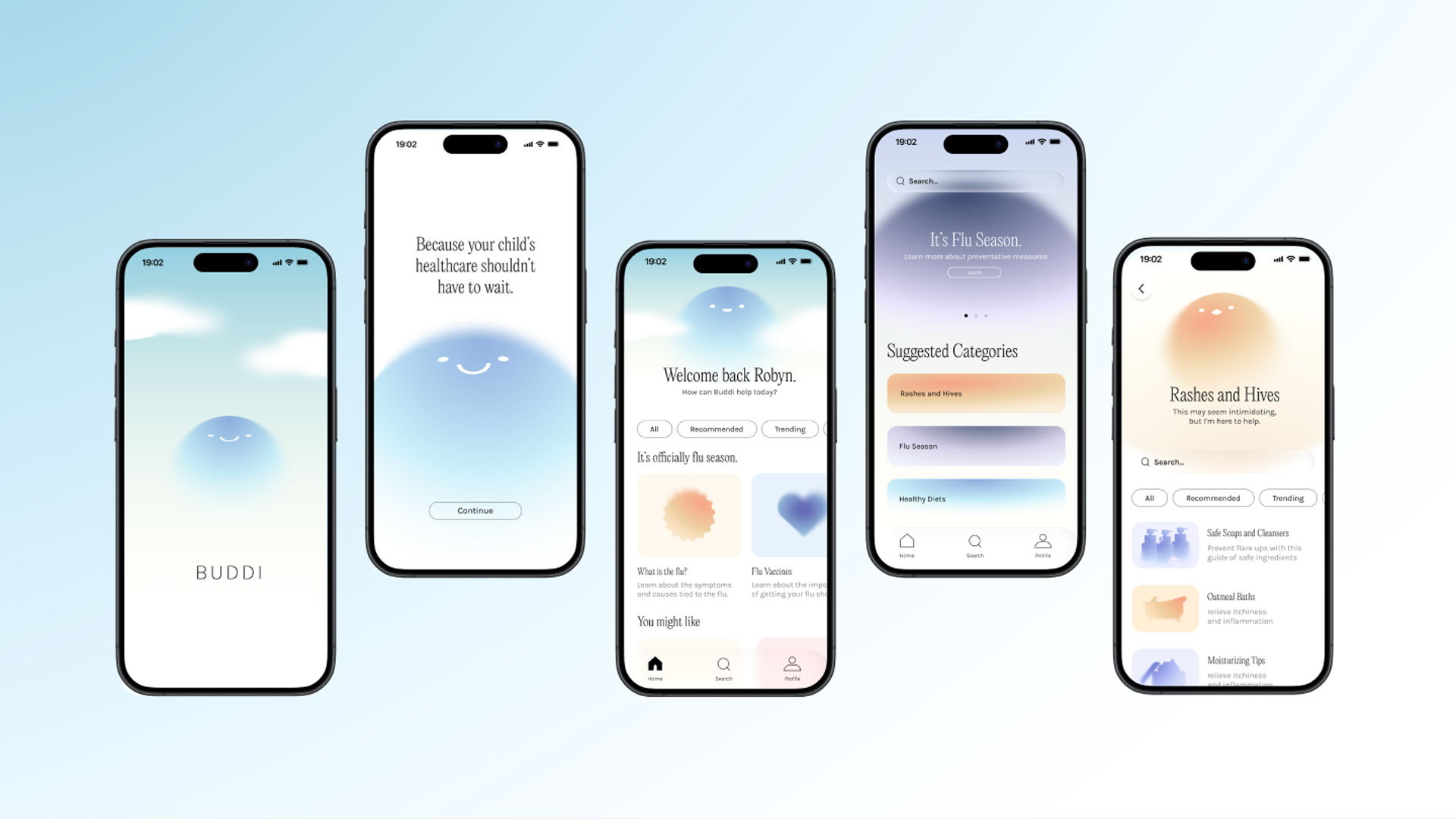
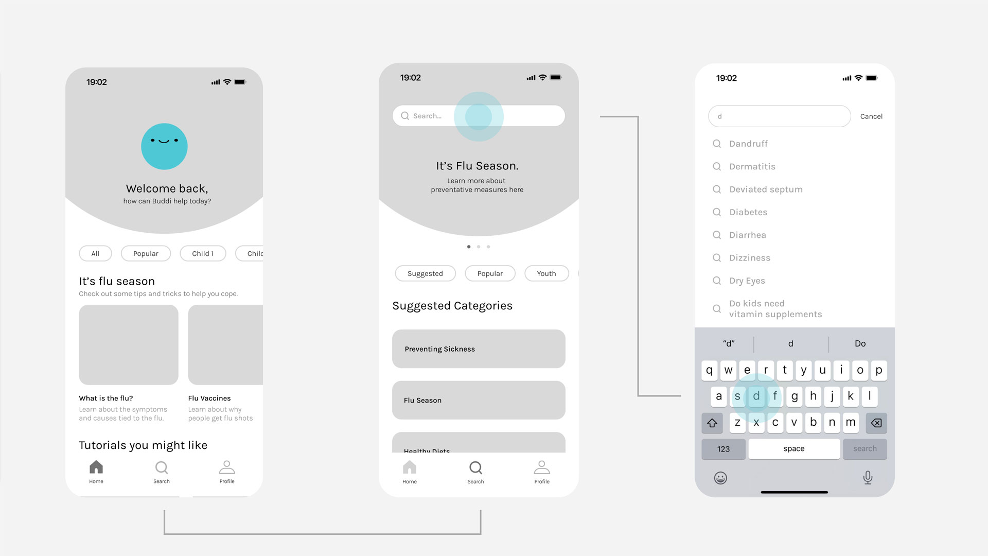
Filtering and Suggestions

Buddi's filtering and suggestion features use personal preferences to provide relevant medical information.

Buddi app icon featuring a simple rounded character face in soft colors

Video and Audio Guides

To make the product more accessible, the platform provides video guides for visual learners and podcast style explinations for those who are on the go.

Buddi app icon featuring a simple rounded character face in soft colors

Tracking and Logging

To make the product more accessible, the platform provides video guides for visual learners and podcast style explinations for those who are on the go.

Reflection

To build a more intuitive and consistent experience, I applied an object-oriented UX methodology throughout the project. I started by identifying the core objects users rely on, then mapped how they interact, change, and connect. This approach gave the design a strong foundation and made it easier to craft interactions that match how people naturally think about the product.

view