Pangea: Case Study

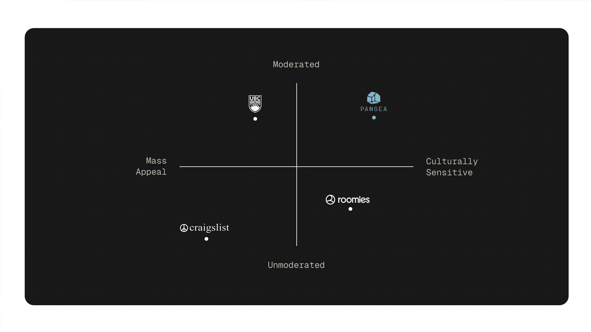
Competetive Analysis
To get a better understanding of the competetive landscape for a roommate searching app, we took a look at 3 different roommate searching platforms. This step helped us to identify commonalities between the different services and allowed us to identify what opportunities are avaliable within the market for our brand and product.
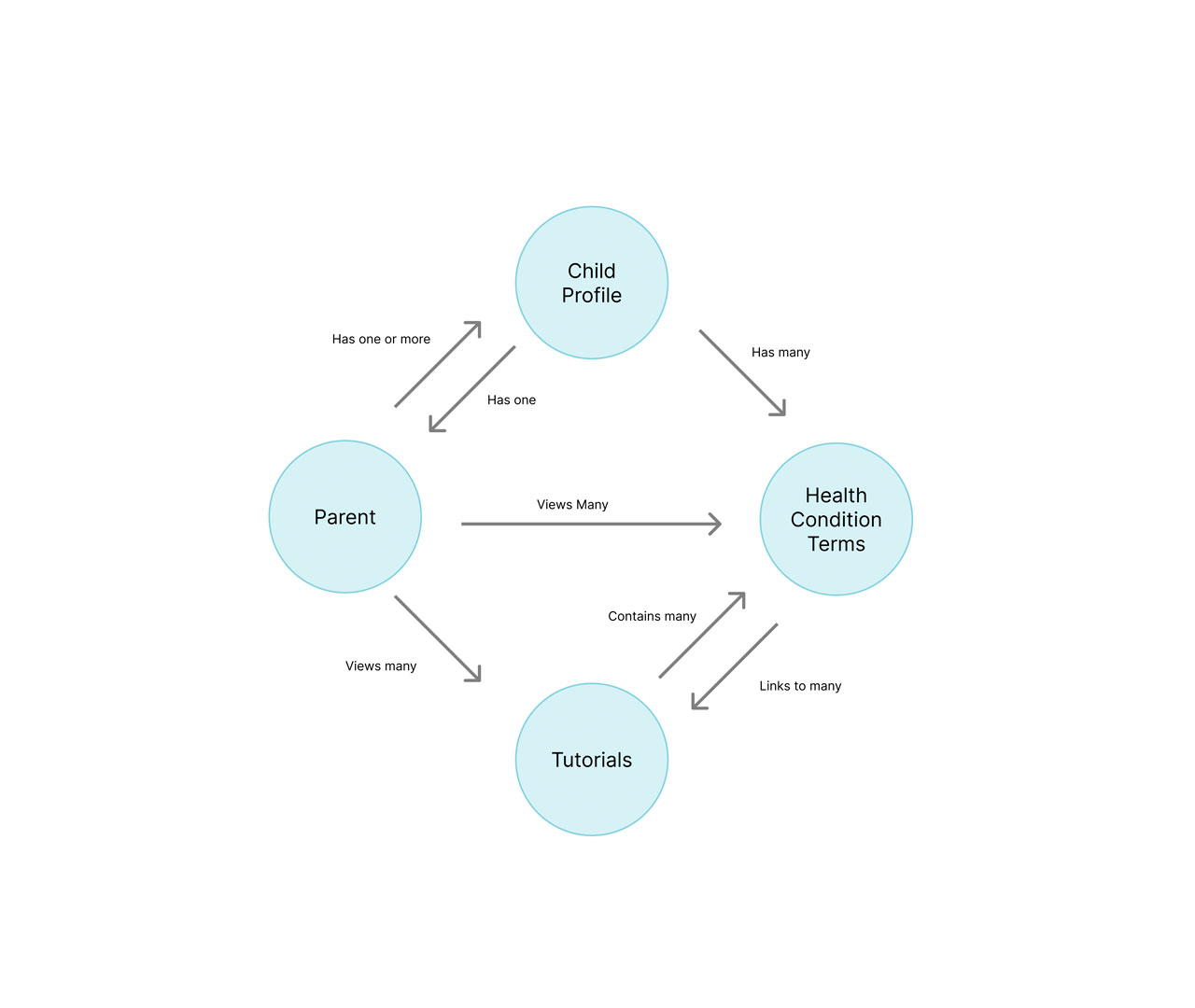
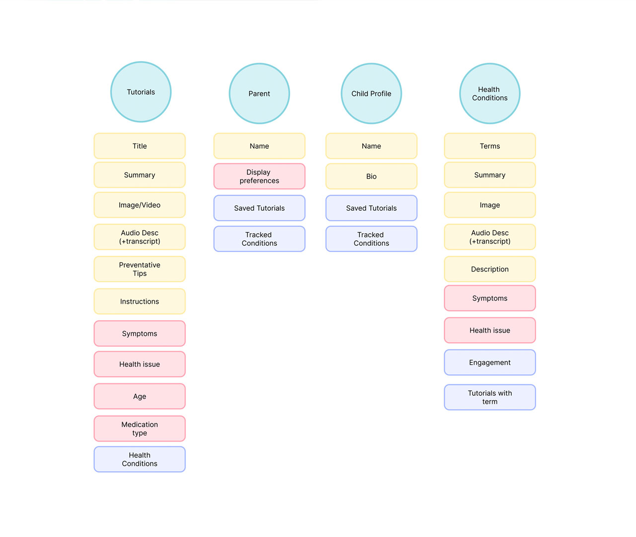
This process made it clear there was a gap in the market for intentional, personality and habit based roommate matching that prioritizes cultural exchange.
Surveying
After analyzing the market and identifying the solution we wanted to design, we gathered 15 survey responses and 5 interviews.
Secondary Research
After analyzing the market and identifying the solution we wanted to design, we gathered 15 survey responses and 5 interviews.
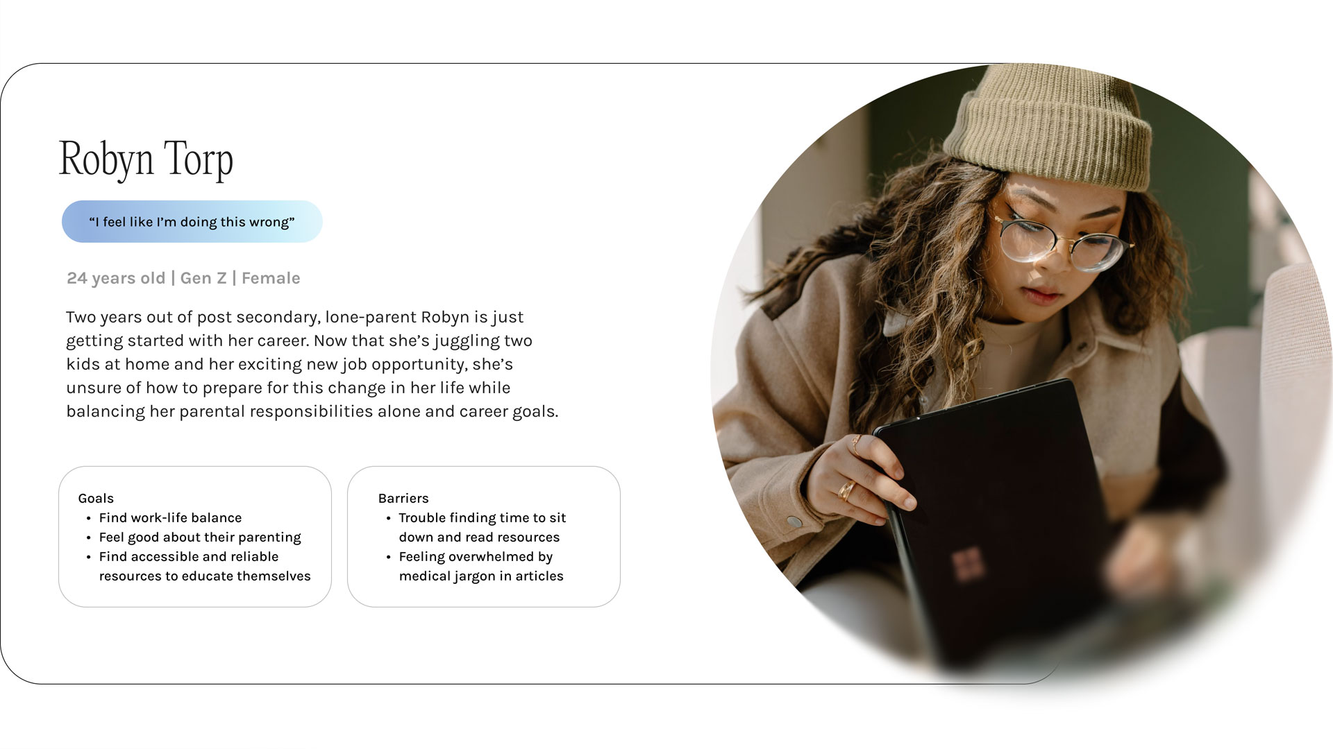
Audience Personas
After analyzing the market and identifying the solution we wanted to design, we gathered 15 survey responses and 5 interviews.

Final Takeaway
In order to better understand the target audience, I conducted research using secondary sources.